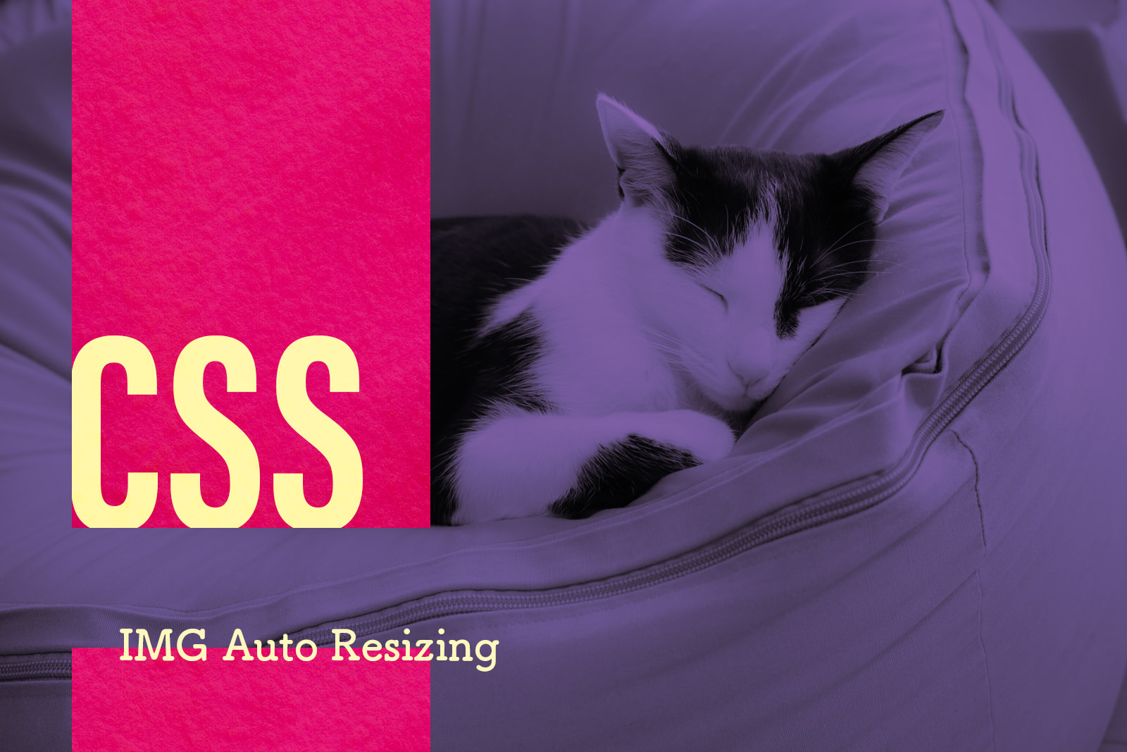
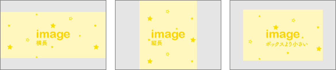
要件概要:
- ボックスのサイズは固定
- 横長の画像が来たらボックスの横幅に合わせる
- 縦長の画像が来たらボックスの縦幅に合わせる
- 画像サイズがボックスサイズより小さい場合はそのまま
- 縦横中央揃え
結論からいうと、「縦横中央揃え」以外の要件は下記のCSSで実現できます。
img {
    width:auto;
    height:auto;
    max-width:100%;
    max-height:100%;
}
ボックス内で画像を縦横に中央揃えさせたい場合も多いと思います。デモを用意しましたので、ご参考下さい。
See the Pen 4 way to keep image ratio inside a box by wang (@yaquawa) on CodePen.
全部で5通りの方法です。ボックスの端をドラッグしてリサイズしてみてください。ボックスのサイズに応じて収まり方も変わってくることが確認できると思います。
HTML
<section>
  <h1>table-cell</h1>
  <div class="img-container--table-cell">
    <img src="https://1design.jp/wp-content/uploads/2016/08/P3290097.jpg" />
  </div>
</section>

<section>
  <h1>precedo inline-block element</h1>
  <div class="img-container--precedo">
    <img src="https://1design.jp/wp-content/uploads/2016/08/P3290097.jpg" />
  </div>
</section>

<section>
  <h1>absolute-position</h1>
  <div class="img-container--absolute-position">
    <img src="https://1design.jp/wp-content/uploads/2016/08/P3290097.jpg" />
  </div>
</section>

<section>
  <h1>flex-box</h1>
  <div class="img-container--flex-box">
    <img src="https://1design.jp/wp-content/uploads/2016/08/P3290097.jpg" />
  </div>
</section>

<section>
  <h1>object-fit</h1>
  <div class="img-container--object-fit">
    <img src="https://1design.jp/wp-content/uploads/2016/08/P3290097.jpg" />
  </div>
</section>
CSS(SCSS)
img {
 max-width: 100%;
 max-height: 100%;
 width: auto;
 height: auto;
}

.img-container--table-cell {
 position: relative;
 width: 350px;
 height: 350px;
 display: table-cell;
 vertical-align: middle;
 text-align: center;
 border: 1px solid darkgray;
 img {
 vertical-align: middle;
 }
}

.img-container--precedo {
 position: relative;
 width: 350px;
 height: 350px;
 text-align: center;
 border: 1px solid darkgray;
 &:before {
 content: '';
 display: inline-block;
 vertical-align: middle;
 height: 100%;
 width: 0;
 margin-left: -0.3em;
 }
 img {
 vertical-align: middle;
 }
}

.img-container--absolute-position {
 position: relative;
 width: 350px;
 height: 350px;
 border: 1px solid darkgray;
 img {
 position: absolute;
 left: 0;
 right: 0;
 top: 0;
 bottom: 0;
 margin: auto;
 }
}

.img-container--flex-box {
 position: relative;
 width: 350px;
 height: 350px;
 display: flex;
 border: 1px solid darkgray;
 img {
 margin: auto;
 }
}

.img-container--object-fit {
 position: relative;
 width: 350px;
 height: 350px;
 border: 1px solid darkgray;
 img {
 width: 100%;
 height: 100%;
 object-fit: scale-down;
 }
}
flex-box と object-fit 以外の方法はモダンブラウザはもちろん、IE8以上にも対応しているのでかなり実用的です。個人的には「absolute-position」を好んで使ってます。
こういうのって意外とCSSだけでできちゃうので、jsに手をわずらわすこともなくていい感じです〜


